Advanced Typography With OpenType and CSS
What is OpenType?
OpenType is the font format you’ll most often encounter when using custom fonts for your web project. OpenType is an advancement over older font formats such as TrueType and PostScript Type 1 and allows the advanced typographic features that you can configure in CSS Type Studio.
Font formats for the web quickly get confusing, especially when you examine the file extension for the font you’re intending to you use. There are two things to know to help you make sense of it. First, there are font container formats and font file formats.
A font consists of a container that packages a font encoded in a file format.
The container format for web fonts is Web Open Font Format (WOFF). WOFF comes in two versions, denoted by the file extensions .woff and .woff2. WOFF 2.0 is the newer version, and is the one used by Google Fonts. (Google Fonts is the font library used by CSS Type Studio.)
Font formats include OpenType, TrueType, and deprecated formats such as Embedded OpenType and PostScript Type 1.
A WOFF file will contain an OpenType or TrueType font. Confusingly, the font data in an OpenType file can be encoded in either TrueType or Compact Font Format and have a file extension of .ttf or .otf, respectively.
In other words, a .ttf file could be a font using an older TrueType specification (which dates back to the 1980s) or an OpenType file. If it’s the latter, the font might include advanced OpenType features such as full Unicode support.
Bottom line: all the major browsers support WOFF 2.0, so this should be your first choice if your font vendor gives you a variety of options. Both TrueType and OpenType encoded fonts can support the features used in CSS Type Studio. Older TrueType fonts that you might have laying around in an old folder or CD-ROM are not a good choice for use on the web.
Deep dive articles on OpenType
This article will give you a quick overview of the features found in OpenType. If you want a more thorough explanation, the articles below will give you a deep dive into every topic:
- Capitals: small caps and titling alternates
- Ligatures: common ligatures, contextual alternates, discretionary ligatures, case-sensitive forms
- Numerics: fractions, lining and oldstyle figures, ordinals, proportional and tabular figures, slashed zeroes, superscripts and subscripts
- Stylistic features: historical forms, historical ligature, stylistic sets, stylistic alternates, swashes
- Google Fonts OpenType Features: What’s Missing and Why
Variable and static fonts
Typefaces are delivered as one or more font files. In the most common approach, different weights and styles of a font are delivered in separate files. For example, on your computer, you might find font files for Arial, Arial Bold, Arial Italic, and so on. If you want to use a weight or style for which you don’t have a corresponding file — such as semibold — the font won’t be rendered as intended. These types of fonts are called static fonts.
In contrast, variable fonts allow the user to select from a continuous range of a given property. For example, IBM Plex Sans — the typeface used for the control labels in CSS Type Studio — is a font with variable weights from thin (100) to bold (700). You can specify want any weight between these values. For example, if you wanted a bold that is slightly less bold than bold, you could specify a weight of 650, and the font will be rendered accordingly.
Variable fonts are supported in macOS, Windows, and Linux operating systems since roughly 2017, and in all current web browsers.
Kerning
CSS property: font-kerning
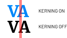
Kerning is the process of adjusting the space between specific pairs of letters. For example, the letter combinations To and VA are often kerned to remove space between the letters, while the combinations of ry and gy might be kerned to add space.
Note that kerning should not be confused with tracking, which is the adjustment of spacing between all characters in a block of text. In CSS, tracking is implemented using the letter-spacing property.
In CSS, the font-kerning property defaults to auto, but it can be disabled by setting font-kerning: none. Take a look at how the spacing changes between the letters VA with and without kerning enabled:
Small caps
CSS property: font-variant-caps
Small caps are shorter than full-size (titling) caps. Typically, they are scaled to the x-height of the font. However, software (including web browsers) will often simply scale down the full size caps, which results in the stroke weight and other proportions of the font being incongruous with its normal size. This becomes apparent when synthesized small caps are displayed alongside the original full size caps. Here is an example using Bodoni Moda SC:


If you need to use small caps, look for typefaces ending in “SC” and set font-variant-caps to small-caps or all-small-caps. You will also need to set font-synthesis-small-caps: none because browsers will default to using synthesized small caps instead of using the real small-cap characters in the font.
Optical Sizing
CSS property: font-optical-sizing
Optical sizing is a property available in some variable fonts that modifies the font to make it more appropriate for viewing at different sizes.
Conventionally, a font is simply scaled up or down when it is set at different sizes. This can result in the weight of the font being less than ideal for its purpose. For example, the features that make a book weight font, such as Times New Roman, suited for purpose at smaller sizes can make the same font less attractive when used at display sizes.
Display fonts are intended to be used at larger sizes and can have features such as high contrast, open counters, or decorative details. However, these same features can make display fonts less readable when used for continuous blocks of text set at smaller sizes.
A typeface may provide separate display and text families for this purpose. For example, take a look at the difference in cap-height, contrast, and width between Libre Caslon Display and Libre Caslon Text:
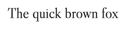

With variable fonts that are designed with optical sizing, these adjustments can be made automatically by the web browser. The variations aren’t limited to stroke or x-height. The designer might decide to change the letterforms in other ways. For example, look at the differences in Fraunces with optical sizing on and off. Not only does the contrast differ, but notice the vertical strokes in h, m, and n:
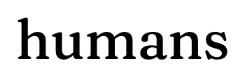
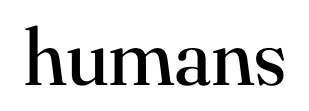
Optical sizing is turned on by default in web browsers. This means that it will switch the optical size variant in a font automatically according to its size. This is how Fraunces is described by its designer Undercase Type:
At smaller sizes, the letterspacing opens up, x-height increases, and contrast decreases to allow for easier reading. Additionally, at 18 pt/px and below, substitutions for the “wonky” characters are made automatically.
Ligatures
CSS property: font-variant-ligatures
A ligature is a combination of two or more letters to form a single glyph. There are four categories of ligatures that you can configure in CSS Type Studio:
- common ligatures
- discretionary ligatures
- historical ligatures
- contextual alternates
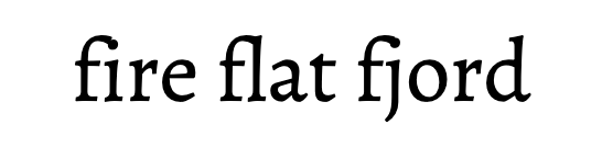
Common ligatures are letter pairs such as ff, ft, fi, and tt. These letter combinations can result in awkward collisions between parts of the letterforms, such as with the bar in the letter f. With ligatures enabled, these letter combinations will automatically be replaced by the corresponding ligature in typefaces that support it.

Historical ligatures are used to display historical or ornamental glyphs that are not commonly found in modern text. They are rarely implemented, but can sometimes be found in historical, blackletter, and script typefaces. One example is the letter combinations of st and ct, which is rendered in Monotype Baskerville like this:
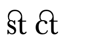
(Note: the versions of Baskerville available on Google Fonts do not have these historical ligatures.)
Contextual alternates, also known as contextual forms, are substitutions made depending on the presence of neighboring glyphs. For example, Inter is a typeface designed for user interfaces, with particular attention paid to combinations of glyphs found in UI interfaces and computer applications.
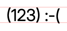
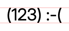
Notice how the baseline of the pair of parentheses is shifted to better align with the figures 123, while the standalone parenthesis in the emoticon is not substituted with its contextual alternate. This substitution happens automatically according to the surrounding context when contextual alternates is enabled.
Ordinals
CSS property: font-feature-settings: "ordn"
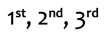
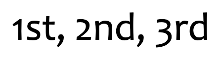
In typography, ordinals refer to the letters following a numeral that indicate its sequential order. Here are some examples of ordinals: 1st, 2nd, 3rd, and 4th.
Diagonal fractions
CSS property: font-variant-numeric: diagonal-fractions
Arbitrary diagonal fractions are a feature found in a few OpenType typefaces. To be clear, many typefaces include glyphs for the most common fractions. For example, the HTML entity ¼ will display ¼. (Note that in modern browsers, you can simply embed the character directly when the charset of your HTML is set to UTF-8.)
But these are fixed characters that are provided by the type designer. If you want a nicely typeset fraction that isn’t provided in your font, you’ll need a typeface that provides diagonal fractions.
Diagonal fractions work similar to common ligatures. When a number-slash-number combination is detected, the software will substitute those characters with a diagonal fraction character. Here's how this looks with EB Garamond:


Tabular and proportional numbers
CSS property: font-variant-numeric: tabular-nums and font-variant-numeric: proportional-nums
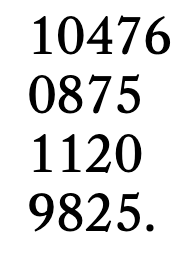
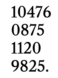
Most non-monospace typefaces have proportionally-sized numbers, but that’s not desirable for situations where you would like columns of numbers to be in alignment, such as in a table or spreadsheet.
Tabular numbers instead are designed with the same width. Some typefaces contain both tabular and proportional numbers. Here's a comparison of the proportional and tabular numbers in Libre Caslon Text:
Lining and old-style numbers
CSS property: font-variant-numeric: lining-nums and font-variant-numeric: oldstyle-nums
Lining numbers or figures are the same height as the uppercase characters in a typeface. For this reason, they’re also known as titling figures because they are suited for use in titles and headlines.
In contrast, old-style numbers or figures use the height of lowercase characters as a reference point. For this reason, they’re also called text figures because the lowercase height aligns better with body text.
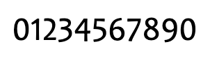
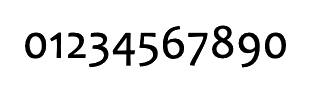
Not all old-style figures in a typeface may be x-height. In Candara, some figures are cap-height and some have descenders:
Font Synthesis
CSS property: font-synthesis
The font-synthesis property in CSS allows you to select whether the browser can fabricate a font style or weight that a font file does not supply. The browser might do this by making the strokes of the font thicker or thinner in the case of a missing weight, or slanting the strokes if you request italics when it not exist.
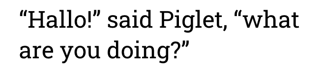
Fake italics, in particular, can be a poor imitation of true italics. For example, Roboto Slab does not include italics, but this is how a web browser will display it with font synthesis enabled:
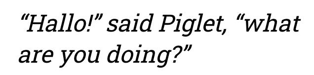
Contrast this with Zilla Slab, which is a similar typeface that does include italics:
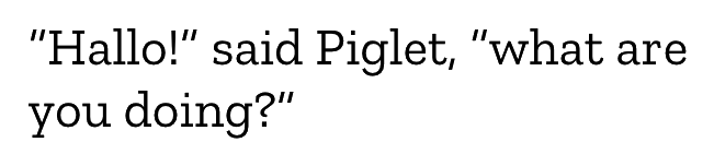
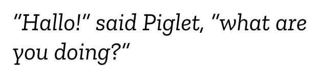
Notice that the strokes are not just slanted, but the letterforms have a different shape, especially the lowercase a, e, and y.
Font synthesis for small caps, styles, and weight is enabled by default in browsers.
Text Rendering
CSS property: text-rendering
The text-rendering property allows you to control how fonts, which are encoded as vector shapes, are rasterized to the screen.
The auto setting is suitable for most use cases, but designers who are particular about typography may want to exercise greater control.
optimizeSpeed discards typographic features, such as kerning and ligatures, that take longer to render. This feature was first implemented in browsers starting around 2010. Because processors have gotten much faster since then, the minimal performance gain from this setting is less relevant now, even on mobile browsers.
geometricPrecision prioritizes accurately rendering the shape of a font, which means disabling font hinting, anti-aliasing, or both. These features slightly alter the shape of the font from its original design, which may or may not be desirable depending on the size of the font, the capabilities of the computer screen, and the usage of the font in the page design. optimizeLegibility, which preserves font hinting and anti-aliasing — as the name suggests — typically results in better legibility, especially at smaller font sizes. The difference between these two settings tends to be less noticeable on a high-DPI display (such as an Apple Retina display).
Rarely used features
Slashed zeros are present in several typefaces aimed at technical usage. However, Google Fonts always seems to remove these features from fonts served from their hosting service in order to minimize the download size. If you want to use a typeface that does include slashed zeros, you can download the font files from Google Fonts or the type foundry and use them directly. (Fonts downloaded from Google Fonts should include all of the original features, even if they are not included in the cloud hosted versions.)
Typefaces that include slashed zeros in their full versions include Inter, JetBrains Mono, IBM Plex Mono, Source Code Pro, Roboto Mono, Inconsolata, and Fira Code.
Discretionary ligatures are usually ornamental or historical in nature, and are rarely needed in regular texts. However, you may find them useful for some design projects. Similar to slashed zeros, Google Fonts seems to remove discretionary ligatures in fonts from their hosting service, but are available in fonts downloaded directly.
Mrs Eaves, designed by Emigre, is an example of a typeface that includes discretionary ligatures.
While diagonal fractions are found in several OpenType typefaces that are available on Google Fonts, stacked fractions are not. Stacked fractions use a horizontal bar to separate the numerator and denominator.
Despite the unavailability of these rarely used features in fonts served by Google Fonts, the option to choose these features is being retained in CSS Type Studio because in the future we’ll allow users to use any locally-installed fonts.
Petite caps have a lower height than small caps. This is a rare feature that is usually only implemented in fonts that have a small caps. Selecting petite caps in CSS will often display small caps instead.